


Tappy Feet
The brief:
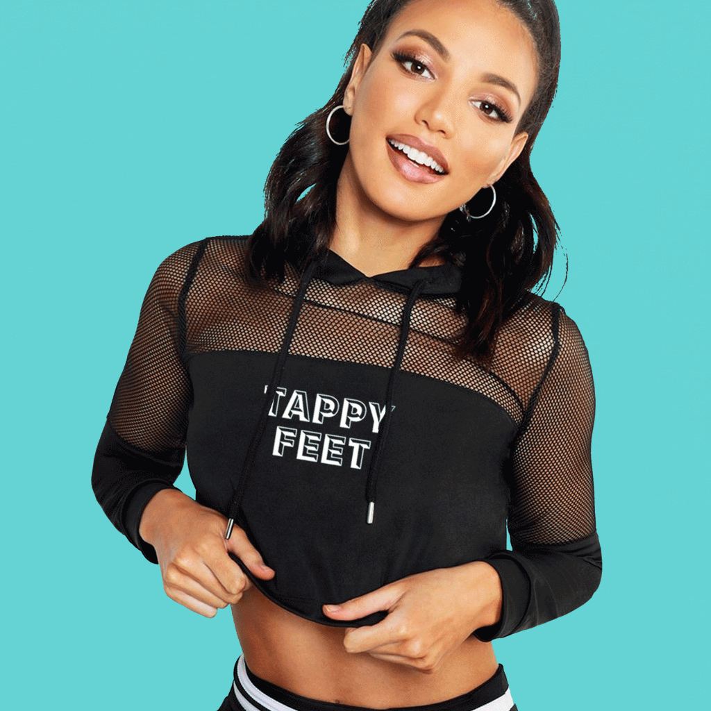
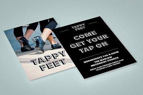
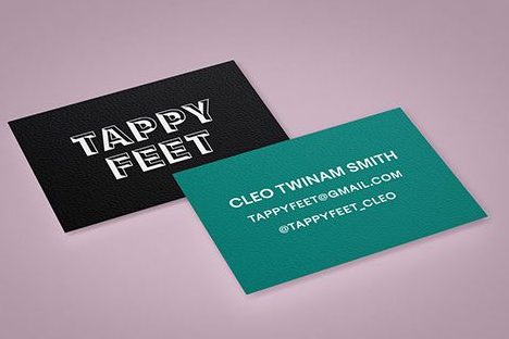
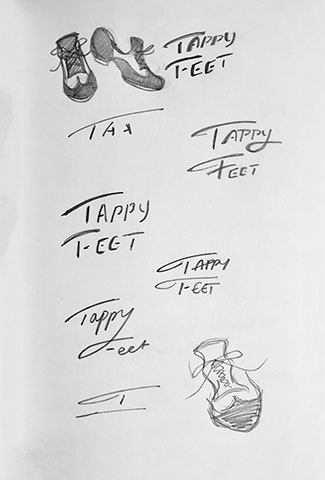
An independent tap dancing studio asked me if I could design them a brand identity. I created a black and white all singing all dancing logo which I pushed across their social pages, promotional mailouts and merchandise.
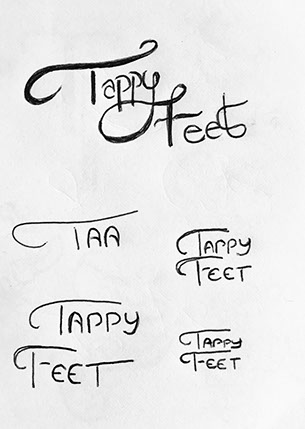
I wanted to reflect the idea of dancing black and white
tap shoes with by symbolising it with a punchy drop shadow typeface, I also liked the idea of the double
’P’ and ‘E’ aligned as if they were about to dance. This
was a great project with a lot of freedom and energy.